
Monday, December 12, 2016
Little Friends Kinder Card
Sunday, December 11, 2016
Geometric Portrait

Ive been wanting to work with a low-poly design for a while now and I wanted to create a portrait of myself similar to this one. It think the geometric shapes make it so interesting. I found this design in Pinterest when searching for other polygonal examples. I think It would be awesome to work with a design in this black and white style and add a bold bright type to the design.
Batman Comic Book

I had ran into this batman comic book cover illustration before online and I also ironically came across it while searching for inspiration in the Parkland library. The reason I wanted to post an illustration is because I think illustration is one of most important things in graphic design. Illustrations like these are attention-grabbing, mysterious, and just awesome. These type of works take forever to create and I admire them greatly. Another aspect that I like from this design is the type treatment. Its very readable, sharp, and fits well with the topic.
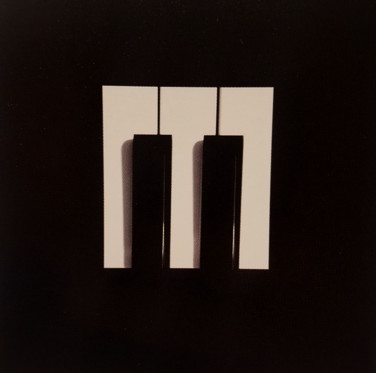
Murray Piano Services
DC Comics Logo

For this weeks blog post I wanted to post about a logo I found at the 2015 graphic design annual. This logo is memorable for many reasons. For one its very modern and all of them have a different feeling but keep the same meaning. DC Comics has many different super heroes and characters so they designed their logo to place emphasis on specific characters by giving them different designs. My favorite one would have to be the Green Lantern on in the bottom center because I enjoy the contrast and the glow definitely gives it the green lantern ring look.
Coca-Cola

Ive came across this branding design many many times and I have always thought it was excellent. This design and branding campaign is so well known not only because it Coca-Cola but because it uses so much consistency in the designs. The design focuses on simple illustrations and silhouettes and uses approaches such as a polar bear protection campaign to increase brand love. This approach leaves consumers excited for what designs Coca-Cola will bring out for winter months. I think Coca-Coca does a great job designing their cans to fit the seasons. Their branding strategy is one of the best.
Watchmen Chip Kidd

This is a design I came across when looking for inspiration for a book cover design. The design is by Chip Kidd. The reason the design really caught my attention is because of the type treatment and the color contrasts. I think that the designer uses his space well to incorporate the type. It does seem a little packed but it is still very legible because of the contrast between black and yellow. Another part of this design that I really like is the illustration. I think the illustration is interesting because it captures a main characters eyes and face in the comic like way. Eyes are an interesting part to a person and having them be on the cover of a book is intriguing.
Subscribe to:
Comments (Atom)